
www.leonedesigners.uk
In this task, I wanna talk about my opinion about this web page as my experience. I have design one web page as my portfolio page so far and also I have had some research about that. According to my research, I will talk about the web page's weaknesses and strengths. In addition, I will write some comments about that.

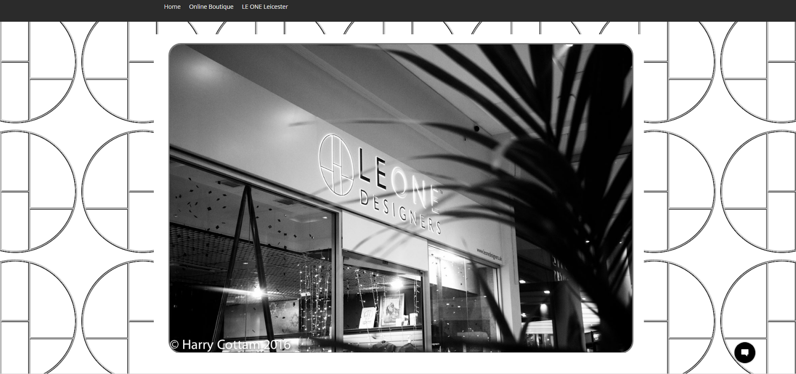

All these images are on the home page of this website. They change almost every 3 seconds. When it comes to web pages, I usually pay attention to the first thing which I see. Even though I am paying attention to images or information but the background of the home page influence on me. If the background is busy, I cannot stay on that web page for a long time or read all the information.
As the first view when I opened the web page, I saw this page with logos on back ground and 3 pictures. First, I would like to talk about back ground. In my opinion, the back ground is busy. it could be more attractive if they have simple back ground and a logo in the corner. Second, I would like to talk about the third picture which is blue. In my opinion, it could be better to use the same style as the first or the second image to make that.
I like the design of content and the colors of the home page, it is clear, not busy and the color is nice.

I found this website for WIX website interesting and good example to show my opinion. Even though there is a lot of different images but the background is very simple and white, this design helps me to see everything clear and organised.

Let's move on the website...
At the end of the web page, there is a short movie. I found it attractive, this is simple, short and show everything natural.
Generally, when it comes to business, I usually pay attention to address and contacts which should be easy to find. I couldn't find any address of this store however, I saw the picture and movie which show there is a store. In my opinion, we should show obviously the location of the store and if it is eye-catching, it can encourage people to come and have a look the store.
Good commentary & visuals Mahtab, please continue to research other commercial websites to help you find inspiration for the homepage wireframe redesign.
ReplyDelete