Home Page
I started with my home page. I tried to change lots of things to find my favourite design and organization. I put below some pictures that show why I didn' chose some of the picture as background and which one is my choice at the end for my website.


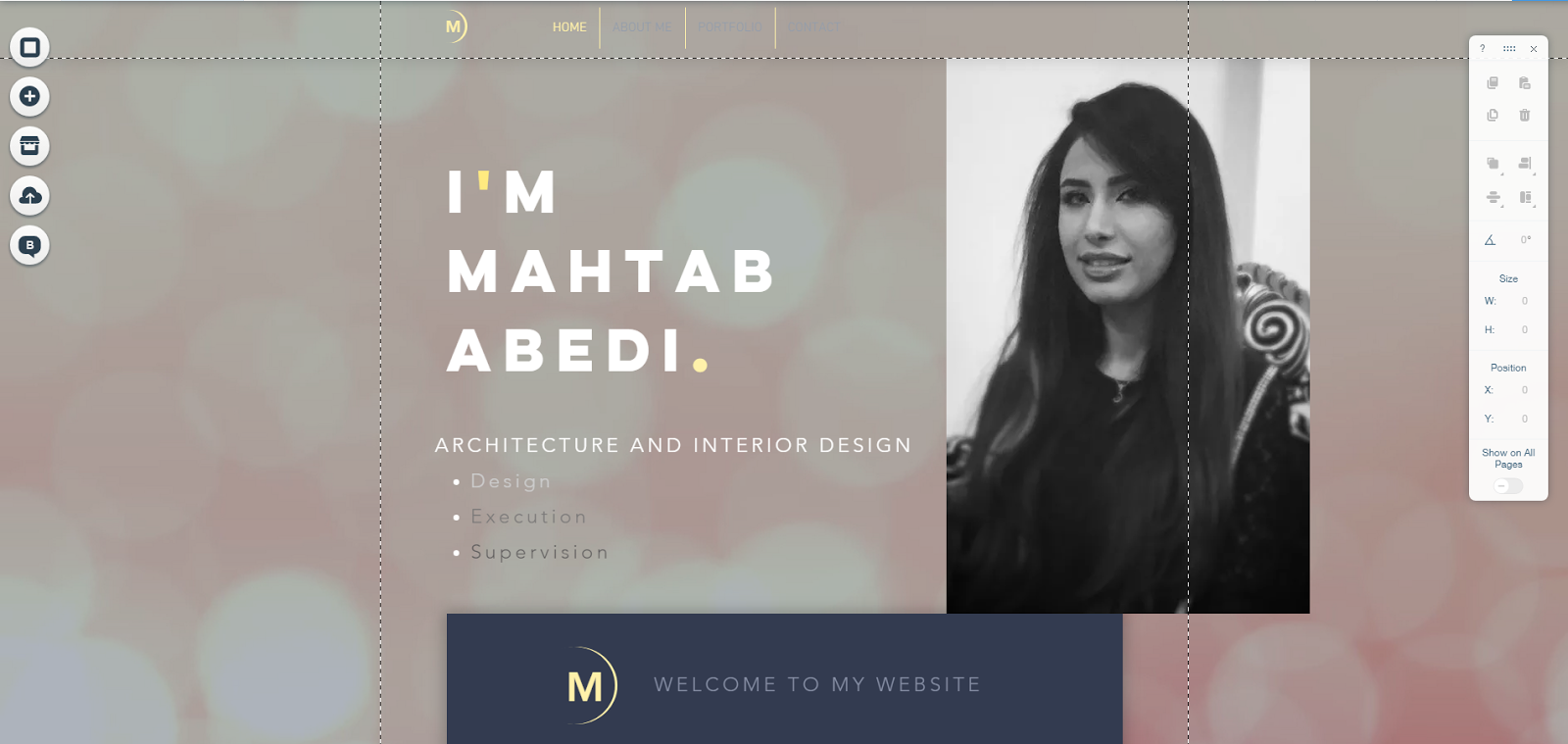
this picture which I put, this is the sample of this page that I have chosen as my website. His name is bold on the first page. I liked this design for putting a name. For that reason, I changed his name and wrote my name in the same font and shape because the font is easy to read and I shows at a glance who is the owner. Next, I wrote my major's name and three points of view of that.

The example shows that the owner put his picture as background but I prefer to have my picture and my background separately. I decided to put my picture as simple. I chose a formal picture because I would like to have a formal website as this is about my educations and experiences.
This picture shows that I tried to change background to find out which of them are suitable for my background. Also as I did some research and I post some of the which inspired me. I have chosen a background which is short video as a bridge with cloudy weather. I chose this video because I found it related to architecture.

This screen shot is the final design of this part of my home page. I have my name and a curve line which is inspired by Moonlight which is the meaning of my name. I have short text as welcome, my picture and my name which is bolder than others. I put some effect on my picture by using photoshop to make it black and white almost because I found it more suitable than colorful also my intention and focus was in my name I didn't want to focus on the picture.
Comments
Post a Comment