FEEDBACK
Erik is my classmate who is working with me in this part. We are giving feedback to each other for evaluating our websites. In this post, I wanna put some screen shot to describe his website.
 |
| https://ericsoon1989.wixsite.com/mysite |
 |
| https://ericsoon1989.wixsite.com/mysite |
this is a contact page which has organised greatly. I opened his website by using other browsers. first, I opened it by google chrome, I found it fast less than 5 seconds it was opened then I opened it by using explorer which was too slow.
 |
| https://ericsoon1989.wixsite.com/mysite |
Third, I opened it by using Firefox browser. This browser was fast the same as google chrome. In all browsers, the website was fine without any problem.
 |
| https://ericsoon1989.wixsite.com/mysite |
I think he should delete the extra layer because this is a sample of the website and made hard to read other information and posts.


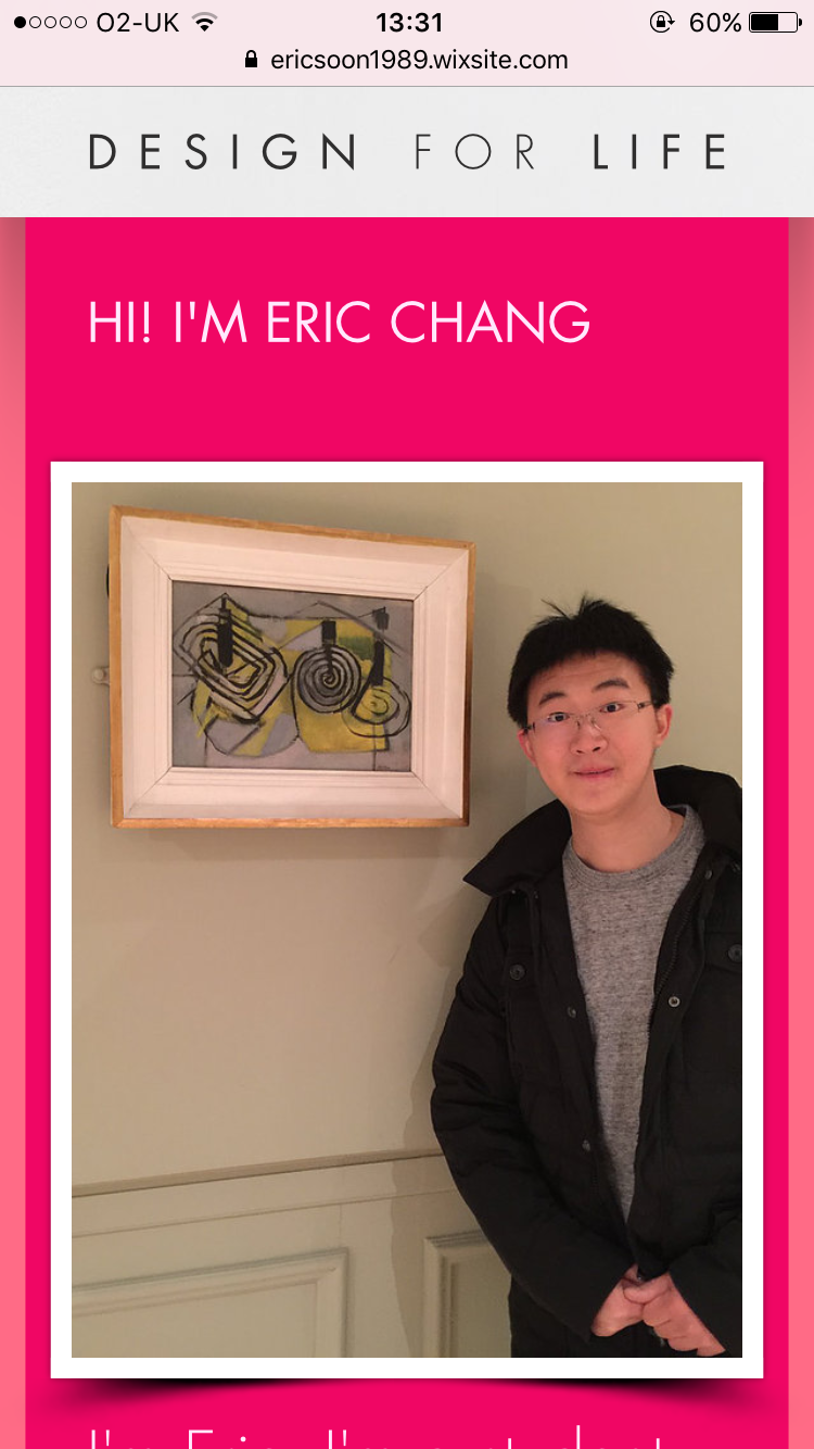
In addition, I opened his website on my phone. when I saw that on my phone I found it very interesting more than PC browser, especially, in the gallery page the sample of picture's grid is not mixed with other posts. the contact page is easy to find, read and fill.
END
Comments
Post a Comment