The Process Of My Final Cover Book
Making a cover book was the first experience for me, especially using some software such as Photoshop was completely new but very enjoyable. The images below show the process of my working on the cover of architecture's book which is my major. Before I began to make the cover, I start to search for some primary research such as standard sizes of books and their covers, the best space to write the name of the title of book and author and also some research about covers how can be interesting for readers, especially, for some writers who are not famous and that is their first book. usually, covers of books don't say everything about books, however, most of them try to tempt people to buy. When I finished my research I start to make it on Photoshop because I found this software useful in this case and also I used Photoshop express to give some effects on my pictures.

First of all, I chose the size of my cover book which is A3 and after I used the ruler (view-ruler) to put some signs to show which spaces I should put my pictures and my notes. In addition, I divided that into three sections of first cover, spine and back cover of the book. In this case, I can manage my working very well.

I decided to start with spine, which is important as same as the first page of cover. Some of the people in a bookstore when they want to find their book may another book with eye-catching spine attract them to buy that book that is why I think the spine is important also. I chose a collage of buildings and I changed the filter with using Photoshop express. I wanted to show with these pictures that this book is about architecture.
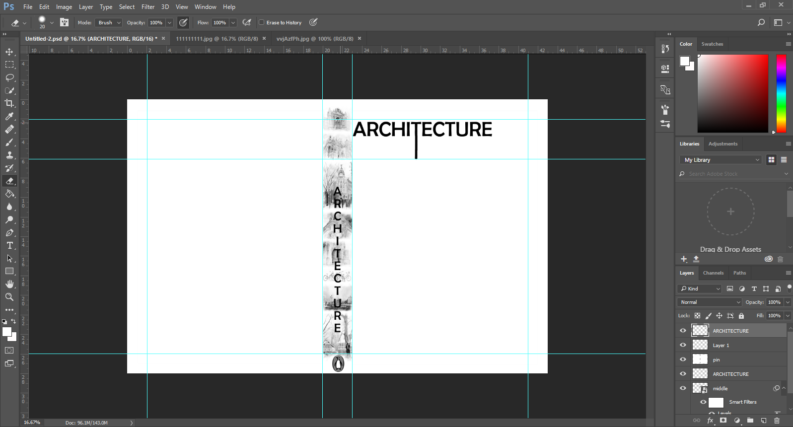
Next, I thought about the title and the author's name, their space, their size and their font on the book. in addition, I put the publisher logo which is part of the book on spine part. usually for every design, I try a lot of models and styles until one of that make me happy but I put just one of them here as an example.

When I fixed the title and spine, I tried to put pictures and play with them to find one of the best among them. I will explain about my pictures why I chose them. At the end of the book, usually, writers write something about the book, that people read them to catch what this book about. I put that below of my picture because I didn't want to hide my picture. On the right-hand side is a different layer that can make easy to change something.

Finally, I chose my cover book as this model. I tried a lot of pictures which showed my ideas as well and I chose this one with barcode and publisher logo which is very important. I chose a black and white colour for my cover because in my opinion architecture and art are creative subjects, we shouldn't say everything to other people, we should create something in their mind and let them think and create everything they want. In this case, I wanted to say, I give you model but you can put every colour you want. This is the first step of creating. The picture which I selected for my first-page cover is related to that which means in art and design we don't have any limitation even we cannot predict what will happen in the future.
A Picture Is Worth A Thousand Words
 |
This is one of the pictures that I chose for the first page. When we want to look at buildings especially, which are huge, we cannot see all of that at a glance. For that reason, I selected them. In addition, I used Photoshop express to make them a black and white and also, I added some effect to make them as same as painting or skis.

This picture shows the reflection of buildings on the river. I chose that because I wanted to say the reflection of the buildings in our life, society and environment have directly influence. I found this picture similar to my idea. I believe, we can show our opinion with our pictures.
(Reference: Haammss.com. (2017). Old Architecture Black And White Hd Desktop Wallpaper High Wide 1610 ~ haammss. [online] Available at: http://haammss.com/vc/215687143/architecture-black-and/215687/ [Accessed 24 Apr. 2017].)

I chose this two pictures to show extremely in architecture. As time is running short and every decade we have a lot of new innovation, so we cannot predict what will happen for architecture in the future. If we compare buildings in two last decades, we can appreciate more about changing in our building either outside or inside.
(Reference: KeywordSuggests. (2017). Similiar Black And White Architectural Art Keywords. [online] Available at: http://www.keywordsuggests.com/eTL90F3c9nU0PgGZ02U%7CfMLhQpr5eH274l40l0mbSJkmWMyVQWBUElpzzUHgyDMtzUFxJXI23r04DeqAat58%7Cw/) (http://haammss.com/vc/215687195/black/215687/ [Accessed 24 Apr. 2017].)

Inside of architecture is the same as another word of that. There is a relationship between outside and inside of architecture. The goal of this picture is showing the relationship between them and also saying we should think about both sides of a building during designing. Sometimes inside of the building can say what we should create in outside. For that reason, architects should know why they need to focus on both of them at the same time.

Barcode
is one of the points of cover that it is essential. "Barcoding reduce
human error, recognition errors and transcription errors. handwriting is a
drudgery and is susceptible to legibility problems. So, there is that. As for
keyboarding, it is undeniably faster" ( Reference: Electronic Imaging Materials. (2017). 10 Reasons to Use Barcodes | The Label Experts. [online] Available at: http://barcode-labels.com/10-reasons-use-barcodes/ [Accessed 24 Apr. 2017].)
Comments
Post a Comment